|
|
||
|
||
|
|
Description
|
|
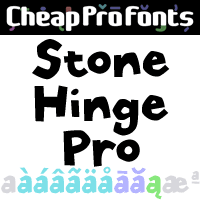
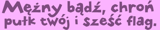
This font has sort of a rustic an ancient look, like stone carvings... The lowercase j has been redesigned to better fit with the other letters, and I've also made an alternate f (as contextual alternate) to make a tighter fit with following tall letters.
|

|
Images
|
|
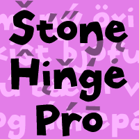
Stone Hinge Pro NEW Promo Picture
|
|