|
|
 |
|
|
|
|
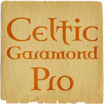 Font # 208-209: Celtic Garamond Pro
14.04.14 12:00
One of our bestsellers has just become even better. Celtic Garamond Pro has been polished up, and at the same time I have made to companions: A Bold version - for more emphasis!
A Rough version - for a more antique look! Enjoy! :)
|
|
|
 Font #205-207: Kremlin II Pro
23.03.14 12:00
Most uppercase letters of this constructivist font are made to look like cyrillic letters, so by carefully interspersing those you can set your text and headlines with it and make it look russian! To a native russian this of course looks very silly indeed, so to make amends for toying with their letters I have also included a full proper and genuine cyrillic character set. This is the second version - also with 4 variants.
|
|
|
 Font #201-204: Kremlin Pro
22.03.14 12:00
Most uppercase letters of this constructivist font are made to look like cyrillic letters, so by carefully interspersing those you can set your text and headlines with it and make it look russian! To a native russian this of course looks very silly indeed, so to make amends for toying with their letters I have also included a full proper and genuine cyrillic character set. This is the original version - with 3 new variants.
|
|
|
 Font #200: Amerika Pro
29.03.13 12:00
This is the 200th font released by CheapProFonts, and again I wanted to make something special - so I have chosen to upgrade another well-known font by the infamous Fredrick "Apostrophe" Nader: Amerika!
The whole character set for this stylish font has been polished for consistent baseline placement and serif thickness, and proper overshoots has been implemented. All the alternate letterforms (and some new ones) have been included as OpenType alternates AND they have now been made available with accents, too! The Greek and Cyrillic letterforms are properly encoded and kerned.
I hope many will enjoy the improvements - and naturally: it is still free! :)
|
|
|
 Font #197-199: Adultometric Pro
31.12.12 12:00
This is the mature version of our previous release Infantometric Pro - The same basic skeleton, but with a more normal x-height. One feature is that no letters (except some accented letters - with cedillas, ogoneks and commaaccents) go below the baseline, so this is one condensed font that is perfect for headlines! :)
|
|
|
 Font #196: Bombora Pro
29.09.12 12:00
Bombora evolved over years of designs in the world of surfing. The native name is given to massive surf building up over a reef, often dangerous, always spectacular. The font was expertly digitized by Brian Kent in New York. This font lives on the beach in a Polynesian grass hut and goes out for a surf before breakfast (o:
|
|
|
 Font #195: Major Snafu Pro
12.08.12 12:00
Classic stencil typeface. Please note many of the letterforms come in two versions - some of the Uppercase letters are filled in while the lowercase letters are open, and there are also other variations to play with. Ten shun!
Vic Fieger says: "Pretty good for a mostly squarish font. Often an entire font can arise from drawing just a single letter. In this case, it was the A."
|
|
|
 Font #191-194: Isbit Pro
30.06.12 12:00
Inspired by the shape of melting icecubes ("isbit" is the norwegian word for "ice cube"), this small superelliptical font family is perfect for logos and headlines. An alternate lowercase a and n is available as stylistic alternates - and a straight lowercase j (which also will be automatically substituted when the nornal j would collide with the preceding glyph).
|
|
|
 Font #190: Foobar Pro Regular
12.05.12 12:00
Please enjoy this free "Regular" weight of our new 8-face family Foobar Pro. Download it and take it for a spin. Test out the quality of the outlines and the language support - and then come back for the rest of the family! ;)
|
|
|
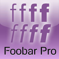 Font #183-190: Foobar Pro
10.05.12 12:00
This is the cool and stylish relative to Familiar Pro. Like a cousin. Or perhaps a second cousin twice removed. Because parts of the letters are removed, see...
|
|
|
|
|
|
|
|
| New Releases |
14.04.14 12:00
One of our bestsellers has just become even better. Celtic Garamond Pro has been polished up, and at the same time I have made to companions: A Bold version - for more emphasis!
A Rough version - for a more antique look! Enjoy! :)
|
|
|
|
| Rogers Blog |
|
27.09.20 9:48
Wow! It has been 8 years since my last entry! Time flies! This is just a quick note to let you all know this site and its owner is still alive. There are no new fonts being reworked and released at the moment, though - I am too busy with my daytime job and other projects.
|
|
|
|
|
|